Yield Curve Patterns – What To Expect In 2020
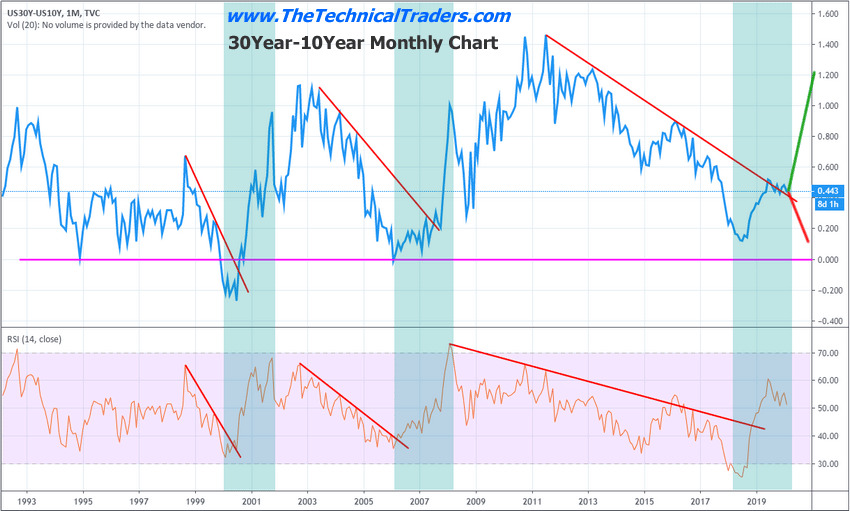
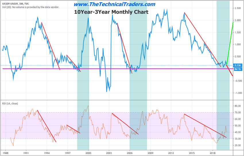
Quite a bit of information can be gleaned from the US Treasury Yield Curve charts. There are two very interesting components that we identified from the Yield Curve charts below. First, the bottom in late 2018 was a very important price bottom in the US markets. That low presented a very deep bottom in the Yield Curve 30Y-10Y chart. We believe this bottom set up a very dynamic shift in the capital markets that present the current risk factor throughout must of the rest of the world. Second, this same December 2018 price bottom set up a very unique consolidation pattern on the 10Y-3Y Yield Curve chart. This pattern has been seen before, in late 1997-1998 and late 2005-2008.
The reality of these two patterns setting up in the Yield Curve charts suggests that the US and global markets are going to experience a surge in volatility and a very real potential that the US and global markets will contract over the next 6 to 24 months. Within about 3 to 6+ months of these patterns setting up, one of two separate outcomes typically takes place.
A. A continued US stock market price advance takes place pushing the Yield Curves lower and ultimately setting up a massive stock market top formation.
B. A moderate price peak sets up where the Yield Curve levels begin to rise from these current levels while the US and global stock markets begin a moderate correction phase – eventually leading into the possibility of a massive price collapse.
Our research team believes the deep price rotation near the end of 2018 set up a very unique capital shift event that took place within the global markets. Currently, there is well over $75 Trillion in the US and global markets. This capital has become enough of a force in the global markets to act as the “moon and the tide”. In a way, this capital, and the search for profits and safety, has propelled the global markets into a very fragile position.
This total amount of capital, in combination with the derivative markets and global credit markets, presents a significant risk for global central banks and nations. Many foreign nations have pushed their debt levels to well over 100% of GDP. Still, even more, have engaged in reckless lending and shadow banking practices that engage a further level of risk to the global markets. Global central banks have taken on excessive debt levels and acquired assets after 2009 in order to help stabilize the global markets. The combination of all of these facets of new capital, risk, and assets add a new dynamic to historical patterns in the Yield Curves.
Even though the patterns are similar in structure, the risks are far greater than in 2000 or 2008. Before, the Central Banks were like a ship navigating the Tides of the seas. Now, the Central Banks have become the Tides and the Moon – they are essentially an omnipresent force in all levels of assets, capital, risks, and contagion.
We believe the 30Y – 10Y yield curve may move slightly lower if any type of reprieve or complacency continues throughout the global markets that risk is not a factor going forward. This would suggest that the US stock market may continue to move a bit higher – possibly seeing the DOW breach the $30,000 level. Otherwise, we believe the Yield Curve may continue to climb suggesting that a global market peak is setting up and a price reversion event is beginning to take place.

This 10Y – 3Y Yield Curve chart highlights the potential for a brief collapse in this level to below ZERO, yet it is not necessary at this point in time to confirm a potential major market peak. Ideally, the future of the US and global stock markets depend on how these yield curves react at this juncture in time. A deeper move to levels below ZERO will suggest a broader market peak is setting up. A rally from these levels would suggest the peak has already set up and that real risk and fear are entering the global markets.

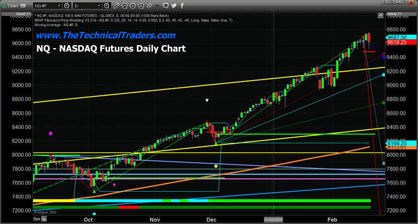
The NQ setup an Engulfing Bearish pattern after a very impressive rally from moderate rotation in December 2019. We highlighted the potential that the US markets are rallying to a peak in a number of research articles recently. The one we’ve included, below, is an excellent example of this type of research.
January 31, 2020: A COMBINATION TOPPING PATTERN IS SETTING UP

As we’ve been suggesting for many months, this is the time for skilled traders to become “cautious long traders”. This upside move could end in a very violent manner as the Moon and Tide shift suddenly as fear and central bank paralysis setup in the markets. We urge all our friends and followers to prepare for this eventual setup and to understand the total scope of this omnipresent capital/debt event. This time will certainly be different because Central Banks have become banker, holders, guarantor and leveraged participants in the future outcome.
Our suggestion is to plan to setup your portfolio so you have sufficient cash in reserve in the event of an unexpected market decline. We also suggest proper protection/hedge investments, such as precious metals and metals miner ETFs. Currently, this single Engulfing Bearish pattern is not enough of a trigger to warn of any immediate action for traders – but the Yield Curve charts are clearly showing us the markets will either continue to rally to an ultimate peak or begin to setup that peak very quickly from current levels.
Think of it this way, we know the music will likely stop at some point in the near future, we just don’t know exactly when it will stop. So, we have to prepare for the scramble for the chairs when it ends.
Join my Swing Trading ETF Wealth Building Newsletter if you like what you read here and ride my coattails as I navigate these financial markets and build wealth while others lose nearly everything they own.
Chris Vermeulen
www.TheTechnicalTraders.com

